You enter a room (this is not the start of a bad joke I promise) – shoulder-to-shoulder denseness fills from wall to wall and head tops rise and fall reminiscent of rugged mountain tops. The mass of humanity is indecipherable, intolerable – pressing on you. It is suffocating, stressful, and a space you seek to escape. At the edge of the room, one person stands apart from the rest, alone yet far from insignificant. It is clear who it is, and what (s)he is doing, your attention rests upon this one – (s)he stands out from the visual clutter.
A great way to add prominence to a visual element is to give it space.
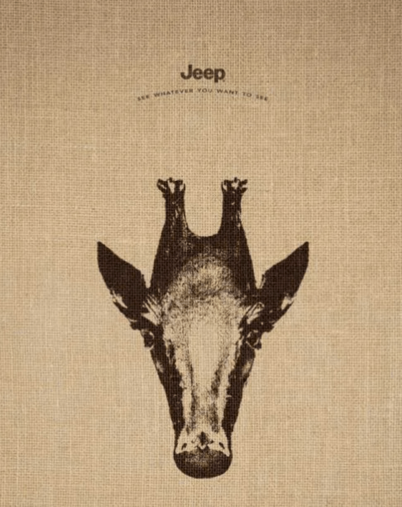
If I only had a Jeep.
Although the Jeep logo above is significantly smaller than the giraffe image, the space surrounding it gives it great significance. When you give a visual element extra space – white space (or clear space) – it grabs your audience’s attention. It creates hierarchy and clarity. It signifies that it is significant or something important is about to happen. You will see this practice in the space given around logos, graphics, and images, after a title or before paragraphs, in well-designed advertisements, websites, and marketing materials. If you recall the story at the beginning of this blog. The person stood out from the crowd because of the empty space around them. The singularity of his/her presence caught your focused attention. It is strategic. When you want to draw attention or amplify the importance of your brand – your logo – give it space. Adding extra space around your website address, social media, or call to action will grab your audience’s attention, and that is good for business.
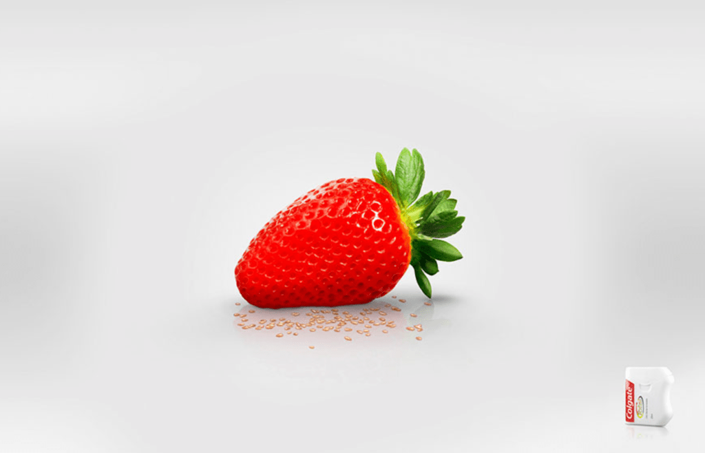
Ah! Colgate floss.
Colgate utilizes white space to draw attention and tell a story. Notice the flow of visual information in the ad above. The strawberry, albeit obscenely delicious, is the problem, and Colgate floss is offered as the solution. The strawberry has the most space around it, although the color and size of the image assist in establishing its place in the hierarchy of the visual information, it is clear that the Colgate floss is subsequently next in line due to the visual cues of being smaller in size, having less white space around it, and its placement at the right bottom of the page – giving direction in the natural flow of reading information on a page, from top left to bottom right.
“I need space, it’s not you, it’s me,” can be, “I need space because it is about you (your audience), check me out.” It’s not about pushing people away but rather pulling people in. So if you want to bring your audience’s attention to something of importance – whether it be on your print collateral or electronic marketing – give it some space!
Follow or connect with me! Let me know what you think about the article or share your ideas! Happy graphics!
Just my $1.398 for the day (my dad used to say that – was his quirky way of saying, that’s just my two cents).
