I command respect from you. I do not need to stomp and sputter, expel my degrees and position, or surround myself with yea-sayers. No! I shall quietly tower over you, my size impressed upon you, a monolith echoing power without much more than a whisper of effort needed to reveal my existence or importance. Here I stand – emboldened, courageous, confident. I exude meaning without further extension. The mere bend and curve of my shape can transform meaning – one that will answer to your will. Transform power to grace, grace to humor, and humor to fear, if the situation calls for it. In these moments, I will be what you need me to be.

The use of the typeface in the above 1995 installation, created by Steven Doyle, commands attention by its sheer size and shape. The words covered the whole main floor of Grand Central Station. These words, taller than the men and women that scuffed upon them, displayed in all caps and bold made an impact on a very important statement being made – there was no avoiding it, there was no ignoring it. I’ve mentioned in my first blog, “What is Graphic Design?” that pictures may be worth a thousand words but a letter can paint a thousand pictures. What if a thousand words made you see the big picture?

representing cyberspace and civil society designed by Hayes Henderson.
Just as color can convey a feeling, so can a letter form, and forms made by letters. Typefaces are expressive in their own right. The shape and size of words in their solidarity or community can convey ominous oppression or depletion of the human race, as shown above in Hayes Henderson’s poster on Cyberspace and Civil Society. The obscurity of its form and violent juxtaposition of its boundaries makes you feel certain that there is looming doom and pain in the future of cyberspace’s coexistence with society.
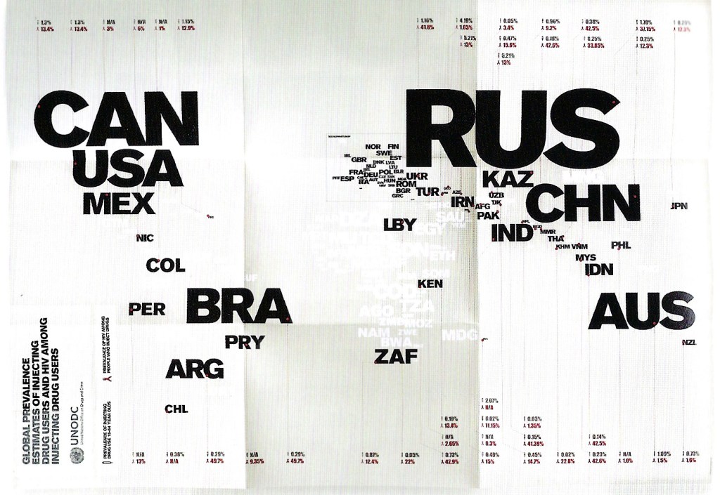
Type does not only evoke emotion, it can clearly and quickly communicate with precision and little effort. Type can express importance in the mere adjustment of its size – creating a hierarchical value – as space can with more or less of itself. The scale of type provides the determination of where to start and where to finish. With just a glance, you can identify the countries that dominate and those that do not, in the above 2009 typographic poster created by Harry Pearce and Jason Ching that compares drug treatment programs, HIV incidence, and other data worldwide.
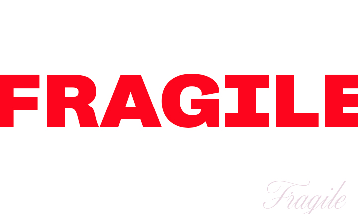
What if one word made you see the big picture? How could that be achieved? Above, I offer an oversimplification of how a typeface, its color, and its placement can tell a story in itself. The first example uses the typeface Campaign, Black (thicker than Bold), in red. The second example below it uses Altesse Standard, in a grayish-purple and yes, the “g” is purposefully hidden out of sight. Which example truly portrays what fragile means? Which of the above examples, could you imagine, would break under the slightest pressure?
Now, let’s say we need to design a book cover. The book is about a girl fighting her own demons and on the brink of losing her mind. Which typographical treatment will you use from the above examples to best reflect what the story is about? Would it be the first example, or maybe the second, or maybe an altogether different variation where red is used with the Altesse Standard typeface? Let me know your conclusions and how and why you came to them.
Share how you have used typography to make a statement or express an idea! Happy graphics, my friends!
Follow me here or on Twitter or let’s connect on Linkedin or Facebook!
Graphic Design (verb): the ultimate trust enhancers, content simplifiers and organizers, efficient and effective information communicators, emotion evokers, and cognition captivators.
